social media insights examples
8 Social Media Insights Examples for Founders in 2026
Discover 8 powerful social media insights examples with actionable metrics to grow your audience. Learn to track engagement, sentiment, and conversions.

Are your social media posts producing business results, or just activity that looks good in a weekly report?
A lot of teams can see likes, views, and follower bumps. Fewer can explain which platform is creating qualified attention, which format drives clicks, or which conversations signal buying intent. That gap is why social reporting often feels busy but not useful.
The practical shift is to measure patterns across networks instead of treating every metric as equal. A reply on Threads does not carry the same weight as a profile click on X. A high-reach post with weak link performance may help awareness but do little for pipeline. A smaller post that brings saves, replies, and site visits can be far more valuable. If you need a benchmark for what counts as strong interaction, start with this guide on what a good engagement rate looks like across platforms.
This article focuses on social media insights examples that small teams can act on. Not vanity metrics. Real signals you can compare, calculate, and use to adjust strategy. That includes engagement rate by content type, reply sentiment, CTR by destination, posting-time patterns, follower growth sources, thread depth, reach-to-impression gaps, and audience shifts over time.
The goal is simple. Turn raw platform data into decisions. Where to post. What format to repeat. Which conversations deserve follow-up. Which metrics belong in a dashboard, and which ones waste your time.
If you manage multiple channels with a lean team, tools such as MicroPoster can help centralize post data so the analysis is faster and easier to maintain. The value is not the dashboard itself. The value is getting to a clear next action from the numbers.
1. Engagement Rate by Platform and Content Type
Raw engagement counts create bad decisions. A post with more likes on X can still be weaker than a smaller post on Threads if your follower bases are different and the audience on one network barely interacts.
That's why engagement rate matters. The standard formula is to divide total likes, shares, and comments by total followers, then multiply by 100, as outlined in Sprout Social's engagement rate explainer. Use that number to compare platform to platform and format to format.
What this reveals in practice
A founder posting product updates across X, Threads, Bluesky, and Mastodon often learns that the same idea performs differently depending on how it's packaged. A short opinion post may get quick reactions on one network, while a threaded explanation wins on another. A poll might draw more replies than a polished launch graphic.
That's the core insight. You're not asking, “Did this post do well?” You're asking, “What kind of post does this audience reward here?”
A clothing brand case study shows the value of that shift. After reviewing engagement metrics and moving its Instagram strategy from static images to video, the brand saw a significant increase in engagement rates and brand awareness, as described in this social media analytics case example. The lesson is straightforward. Format choice isn't cosmetic. It changes results.
How to use it without overcomplicating things
If you publish across several platforms, compare engagement rate by content type for at least two weeks before changing your strategy. You need enough posts to see a pattern, not one lucky outlier.
- Track format separately: Measure text posts, image posts, video clips, polls, and threads in different buckets.
- Normalize by audience size: Use rate, not total interactions, so a larger account doesn't distort your read.
- Watch adaptation quality: If you use a cross-posting tool, compare whether native-looking versions outperform mirrored ones.
- Review platform fit: A post that feels concise on Threads might feel underdeveloped on X.
For a deeper benchmark on this metric, use this guide on what is a good engagement rate.
Practical rule: If one format repeatedly wins on one network, don't “repurpose” it blindly everywhere. Build for the platform where it already proves demand.
2. Reply Sentiment and Conversation Quality Score
A post with lots of replies can still be a bad post. Replies can be spam, low-effort agreement, bot noise, or drive-by negativity that adds nothing.
The more useful read is conversation quality. Are people asking real questions? Are they sharing objections you can learn from? Are they adding stories, examples, or use cases? That's where community starts to become an asset instead of a vanity layer.
A founder might publish two product updates with similar visible engagement and think they performed equally. Then they read the replies. One post triggered thoughtful questions about implementation. The other attracted generic hype and low-value comments. Same count, very different outcome.
Here's the visual lens teams often need:

What to score manually or with AI
You don't need an enterprise listening suite to do this well. For small teams, a simple review system works:
- Meaningful replies: Comments with questions, feedback, examples, or specific reactions.
- Low-value replies: Emojis, one-word praise, recycled comments, obvious bot patterns.
- Constructive negative replies: Criticism that points to confusion, friction, or disagreement worth studying.
- Hostile noise: Replies that create heat but no insight.
This is one place where an automation tool can save real time. If you're posting across networks and replies pile up in several places, MicroPoster's comment analysis features are relevant because they help surface patterns without reading every response one by one.
What works and what doesn't
Personal stories often generate richer replies than curated link drops. Open-ended prompts often outperform flat announcements when the goal is community depth. But there's a trade-off. More conversation also means more moderation work.
Negative sentiment isn't automatically bad. If thoughtful people disagree with you, you probably said something specific enough to matter.
Track this weekly or monthly, not post by post in isolation. What you want is a trend. If your reply quality is rising while your total reply volume stays flat, you're moving in the right direction.
3. Click-Through Rate (CTR) and Link Performance by Destination
Likes don't move a business if nobody clicks. CTR tells you whether people who saw your post felt enough intent to take the next step.
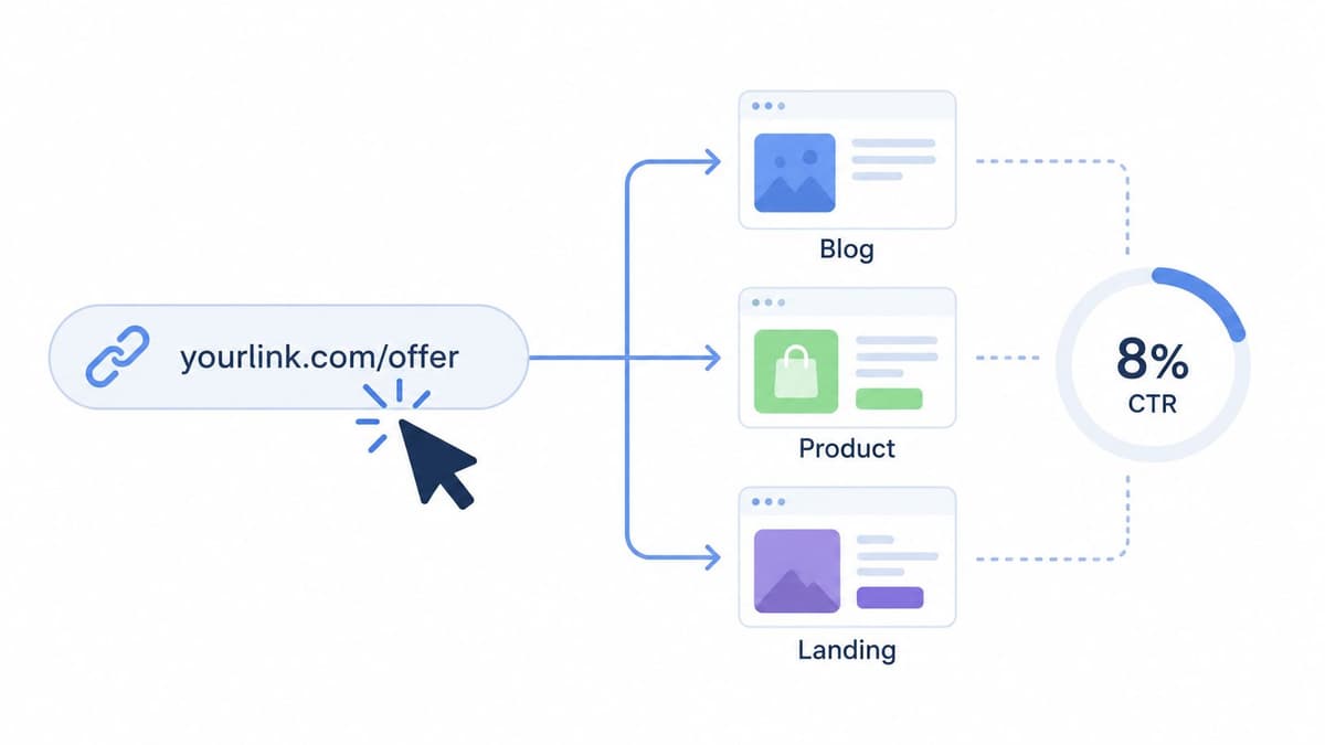
The formula is simple. CTR equals (Link Clicks ÷ Impressions) × 100, as defined in this CTR explanation for social KPIs. That formula matters because it separates visibility from action.
A behind-the-scenes founder post might get fewer public interactions than a punchy hot take, yet drive more clicks to your product page. That's not a contradiction. It's a better sign.
Here's the visual breakdown to keep in mind:
Break links down by destination
Don't lump all links into one bucket. Separate them by purpose:
- Blog links: Usually measure education and discovery.
- Product links: Measure buying intent or feature interest.
- Landing pages: Measure campaign-message fit.
- External references: Measure curation value and trust.
A SaaS founder might learn that tutorials drive stronger CTR than launch announcements. A writer may find essay links outperform newsletter signup links on one platform but not another. A community builder might discover GitHub links work best when wrapped in context, not posted cold.
How to capture the data cleanly
Use UTM parameters consistently. If you don't tag links by source, medium, and campaign, you'll never know which post created which action.
Then compare destination performance by platform. The same link can behave very differently on X, Threads, or Mastodon because user intent is different on each network. This matters for anyone shaping founder-led distribution, especially teams thinking about how AI and Web3 founders build brands.
If a post gets attention but no clicks, it may be entertaining your audience instead of moving them.
Track click-to-conversion ratio too. CTR tells you the post worked. Conversion tells you the destination page did its job.
4. Optimal Posting Times and Timezone-Adjusted Reach
Generic “best time to post” advice is usually too broad to be useful. Your audience doesn't behave like an industry average.
The better read is first-hour performance by platform, content type, and timezone concentration. If your audience is split between North America and Europe, your strongest overlap window may be very different from a founder whose audience sits mostly in one U.S. region.
How to find your real posting windows
Start with your best-performing posts from the last month or quarter. Note the publish time, day, platform, and post format. Then look for clusters.
Some founders discover product updates work best in weekday morning windows, while reflective posts do better later in the day. Some writers learn that how-to threads perform well at the start of the week, while personal observations gain more traction on weekends.
This isn't only about engagement. It also affects downstream results like clicks and reply quality, because audience mindset changes throughout the day.
If you want a framework for testing, this guide on best times to post on social media is useful as a starting point.
The scheduling trade-off founders overlook
Manual posting sounds more authentic, but it often leads to inconsistency. Founders post when they're available, not when their audience is active. Scheduling fixes that, but only if you keep learning from the data instead of setting one default queue forever.
- Review by platform: Your X audience may be active at different times than your Bluesky audience.
- Separate by post type: Launch updates, essays, clips, and polls rarely peak at the same moment.
- Adjust for geography: If your audience is global, aim for overlap windows instead of a single local optimum.
- Retest regularly: Audience habits shift with seasonality, product cycles, and platform changes.
MicroPoster is useful here because scheduling and cross-platform adaptation remove the execution burden, which makes testing easier. The insight still has to come from your review.
5. Follower Growth Rate and Source Attribution
Follower growth without source attribution is hard to trust. You can see the number go up and still have no idea why it happened or whether those followers will stay.
The better question is where new followers came from and what they did next. Did they arrive after a thread, a controversial opinion, a helpful reply, a podcast appearance, or a link from your newsletter? Different sources create different audience quality.
What quality looks like
A founder may notice that a high-visibility post adds a wave of followers who never engage again. Another founder may gain fewer followers through consistent replies and product education, but those people keep showing up, clicking links, and responding to future posts.
That difference changes strategy. One path inflates your dashboard. The other builds an audience that compounds.
A practical way to study this is cohort tracking. Tag followers or periods by source if your stack allows it. If not, use rough proxies: campaign dates, post themes, and bio-link UTM tagging. Then review whether those follower groups continue interacting over the next few weeks or months.
What to monitor
You don't need perfect attribution. You need useful attribution.
- Track acquisition moments: Note which posts or campaigns aligned with follower spikes.
- Compare retention by cohort: Followers gained from one topic may stick longer than followers gained from another.
- Watch first-week behavior: New followers who reply, click, or comment early are often stronger long-term audience members.
- Separate platform effects: One network may grow faster while another produces more engaged followers.
Founders usually make the wrong trade-off. They chase the content that grows fastest, then wonder why the account becomes harder to monetize or harder to steer. Growth quality matters more than growth speed.
6. Thread Engagement Ratio and Reply Depth
Why do some threads rack up likes on the first post, then lose readers before the main point lands?
Thread engagement ratio answers that. It measures how much engagement the full thread earns compared with the opening post. Reply depth adds another layer by showing whether people respond only to the first post or continue the conversation deeper into the sequence.
A simple way to track it:
- Thread Engagement Ratio = total engagement across all posts in the thread / engagement on the first post
- Reply Depth = replies on posts 2 and beyond / total thread replies
If the ratio is low, the opener is doing the work and the rest of the thread is dragging. If reply depth is weak, readers may be skimming without finding enough reason to respond as they go.
This changes how you write. I've seen founders publish solid threads with a strong premise, then lose half the audience because they treated the middle like filler. The fix usually is not a better topic. It is better sequencing.
Three patterns are worth testing:
- Put one clear payoff early: Give readers a reason to trust the thread before post 4 or 5.
- Use transition posts with purpose: Each post should add a proof point, example, or tension point, not just continue the paragraph.
- Ask for response at the right moment: A well-placed question in the middle often gets better replies than a generic prompt at the end.
Questions can help, but only if they create a specific decision or opinion. “Have you seen this too?” will usually underperform “Which step breaks first in your process, acquisition or retention?” Specific questions produce specific replies, which makes the thread more useful to analyze later.
What to look for in the data
A healthy thread usually shows one of two shapes. Either engagement stays relatively stable across the sequence, or a later post spikes because it introduces a concrete example, strong opinion, or useful question. Both are good signs.
A weak thread has a different pattern. Post one gets attention, then every later post drops with no recovery. That usually points to one of four problems: the hook overpromised, the thread is too long for the idea, the formatting makes it hard to scan, or the best point came too early.
A thread works like staged attention. Every post has to earn the next one.
If you use a tool like MicroPoster to turn longer updates into threads across platforms, review the split before publishing. Good automation saves time, but it doesn't replace editorial judgment. The platform can format the thread. You still need to decide where the argument turns, where the example appears, and where a question will get real replies instead of empty engagement.
7. Reach vs. Impressions Gap and Content Virality Score
What happens when a post racks up impressions but barely expands your audience?
Usually, the platform is showing the same post to the same people more than once. That can be useful if the goal is recall or repeated exposure to a warm audience. It is a weak growth signal if the goal is discovery.
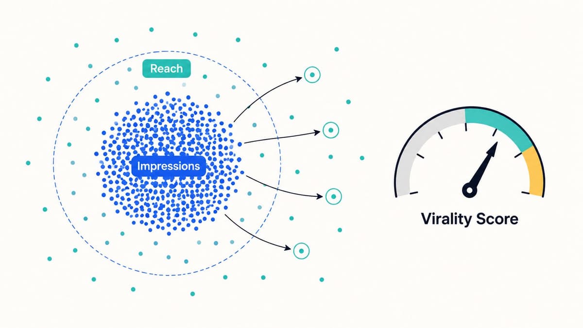
Reach gives the missing context because it measures unique viewers. Impressions show total views, including repeat views. Put those two numbers side by side and you can separate distribution breadth from simple repetition.
Here's the visual model to keep in mind:
How to interpret the gap
Start with a simple ratio:
Impressions per reached user = Impressions / Reach
A result near 1.0 means distribution is broad relative to total views. A higher number means the same audience is seeing the post multiple times.
That is not automatically bad. I often see educational posts, product reminders, and opinion pieces produce a higher impressions-to-reach ratio because platforms keep resurfacing them to people already familiar with the account. Those posts can still drive clicks and conversions. They just should not be mistaken for breakout content.
Broad reach with a relatively low repeat-view ratio tends to point to stronger distribution outside your current audience. That usually comes from shares, reposts, saves, or recommendation traffic from the platform itself.
A practical virality score for small teams can combine four signals:
- Reach efficiency: Reach / Impressions
- Share rate: Shares or reposts / Reach
- Follower conversion: New followers from the post / Reach
- Early velocity: Engagements in the first hour or first day / Reach
If you want one internal score, weight it toward outcomes that matter to your business. For example:
Virality Score = (0.35 x Share Rate) + (0.25 x Reach Efficiency) + (0.25 x Follower Conversion) + (0.15 x Early Velocity)
The exact formula matters less than consistency. Use the same inputs every month so you can compare posts across platforms and content types.
The business trade-off
A wide-reaching post can still be a bad post for the business.
I have seen polarizing takes pull in reach fast, then underperform on clicks, lead quality, and useful replies. I have also seen low-drama product explainers reach fewer people but bring in better followers and more qualified traffic. That is the trade-off founders need to measure. Spread alone is not strategy.
This is why multi-platform analysis matters. A post that looks average on one network may have a much healthier reach-to-impression pattern on another, especially if the format fits that audience better. MicroPoster helps by making those cross-platform publishing patterns easier to monitor, but the true value comes from reviewing the numbers with intent. Track where a post travels, how efficiently it reaches new people, and whether that attention turns into the right next action.
8. Audience Composition Shifts and Demographic Trend Analysis
Are you attracting the people who buy, refer, and stick around, or just the people who react?
Audience composition shifts answer that question better than raw follower growth. A bigger audience can still be the wrong audience. Founders usually notice the problem late, after reach goes up but demos, replies, or conversions get weaker.
This signal matters because content changes who finds you. If you shift from founder lessons to technical analysis, you will usually pull in more operators, builders, or peers with specialist interest. That can help if you sell to that segment. It can also hurt if your business depends on broader buyer awareness or decision-maker attention.
What to measure
Review composition trends every quarter and compare them against your publishing mix across platforms. Focus on a short set of variables you can act on:
- Geography: Are you gaining followers in markets you can serve?
- Language: Is audience growth aligned with the language your content and product support?
- Role or interest: Are more followers identifying as founders, marketers, developers, recruiters, or students?
- Platform behavior: Which segment clicks, replies, saves, or converts, instead of only viewing?
- Audience fit by platform: Does LinkedIn attract buyers while X attracts peers and industry commentators?
One useful working formula is:
Audience Fit Score = (Qualified Segment Followers / Total New Followers) x 100
Define "qualified segment" based on your business. For one founder, that might mean SaaS operators in North America. For another, it might mean creators with paid newsletters or ecommerce brands above a certain size. The definition matters more than making it complicated.
How to read the shift
A change in audience mix is not automatically good or bad. It is a trade-off.
If technical posts bring in more practitioners, you may get better comments, stronger peer sharing, and more product feedback. You may also lose reach with casual readers and reduce top-of-funnel awareness. If broad motivational posts expand your audience fast, you may gain impressions while lowering click quality and sales relevance.
That is why I look at composition changes beside outcome metrics, not in isolation. Pair demographic movement with CTR, reply quality, and follower source data. Multi-platform analysis helps here because the same content theme can attract very different audience segments depending on the network and format. MicroPoster is useful for keeping that publishing data organized across channels, especially for small teams that need one view of what was posted, where, and what audience it pulled in.
A practical review process
Use a simple workflow:
- Tag the last 60 to 90 days of posts by topic, format, and platform.
- Export follower and audience data from each native analytics dashboard.
- Compare audience changes before and after a content mix shift.
- Validate the pattern with polls, short surveys, or lead form data.
- Keep the segments that improve business outcomes. Reduce the content attracting attention from low-fit groups.
One blind spot is private sharing. A lot of audience movement starts in WhatsApp groups, DMs, Slack communities, and copied links, where native social analytics have limited visibility. This breakdown of dark social media sharing and tracking approaches is useful if you want better attribution with branded links, UTM tags, and post-conversion survey prompts.
You do not need perfect demographic data to use this well. You need a consistent way to spot drift early, then decide whether that drift supports the business.
8-Point Social Media Insights Comparison
| Metric | Implementation Complexity 🔄 | Resource Requirements ⚡ | Expected Outcomes ⭐📊 | Ideal Use Cases 💡 | Key Advantages 📊 |
|---|---|---|---|---|---|
| Engagement Rate by Platform and Content Type | Medium, cross‑platform segmentation and content tagging | Moderate, 2–4 weeks baseline data + analytics dashboard | High, identifies best format per network; optimizes creative effort | Multi‑platform creators deciding format adaptation vs. customization | Shows platform ROI; guides where to invest creative time |
| Reply Sentiment and Conversation Quality Score | High, AI sentiment + conversation quality modeling | High, NLP models, labelled replies, larger sample sizes (50+) | High, surfaces substantive vs. superficial engagement; flags toxicity | Community managers, moderation, brand health monitoring | Identifies meaningful replies; flags spam/toxicity early |
| Click-Through Rate (CTR) and Link Performance by Destination | Medium, requires UTMs/shorteners and destination mapping | Moderate, consistent UTM setup, link analytics, dashboarding | High, reveals which posts drive action and conversions | Growth marketers, conversion-focused campaigns, product announcements | Moves beyond vanity metrics; ties social to conversion sources |
| Optimal Posting Times and Timezone-Adjusted Reach | Medium, time‑series analysis and timezone segmentation | Low–Moderate, historical post data + scheduling tool | Medium–High, increases reach and first‑hour engagement without new content | Scheduling for global audiences; cross‑platform coordination | Maximizes reach via timing; automates posting to peak windows |
| Follower Growth Rate and Source Attribution | High, cohort attribution and retention analysis | Moderate–High, cohort tools, UTM/bio tracking, cross‑platform data | High, reveals follower quality and sustainable growth patterns | Audience growth strategy, channel prioritization, forecasting | Distinguishes viral vs. quality growth; measures retention by source |
| Thread Engagement Ratio and Reply Depth | Medium, per‑thread and per‑post distribution tracking | Low–Moderate, thread metrics and A/B testing | Medium–High, optimizes thread structure and completion rates | Writers and educators publishing multi‑part threads | Reveals engagement cliffs; improves thread composition and depth |
| Reach vs. Impressions Gap and Content Virality Score | High, reach measurement + virality coefficient modeling | Moderate–High, reach/impression data, repost/velocity tracking | High, detects breakout content and true audience expansion | Viral strategy, identifying breakout posts to amplify | Differentiates repeat exposure vs. new reach; early virality signals |
| Audience Composition Shifts and Demographic Trend Analysis | High, demographic inference and longitudinal correlation | Moderate, platform analytics, surveys, months of data | Medium–High, informs targeting and content direction over time | Brand positioning, targeting specific demographics, product‑market fit | Enables intentional audience shaping; detects misalignment early |
From Insight to Impact Your Next Steps
What changes next week because of the numbers you already have?
Social media insights matter when they change decisions. The useful loop is simple: publish with a clear goal, measure the response across platforms, compare the result against your baseline, then adjust one variable at a time. That is how small teams turn raw data into growth instead of building another report nobody reviews.
Start narrower than you think. Pick one output metric and one diagnostic metric for the next 30 days. For example, track CTR by destination as the output, then pair it with engagement rate by platform and content type to explain why clicks rose or fell. If trust and community drive revenue in your business, use reply sentiment and conversation quality score instead. The point is to connect a metric to a decision, not to collect a bigger spreadsheet.
I usually recommend a weekly review with four questions:
- Which posts reached the right people, not just more people?
- Which platform sent the highest-quality traffic?
- Which content format produced the strongest next action?
- What should change this week: topic, hook, format, timing, or CTA?
That review does not need an expensive stack. Platform analytics, UTM-tagged links, a simple sheet, and one place to compare cross-platform results are enough for a founder or creator to spot patterns. The trade-off is speed versus depth. Native analytics are fast and free, but they rarely show the full path from impression to click to conversation quality across channels.
That is why multi-platform reporting matters. A post can look average on one network and still be a strong asset if it drives qualified clicks, better replies, or follower growth from the right source on another. Vanity metrics hide that. Comparative analysis surfaces it.
The opportunity is still large, as noted earlier. Big networks continue to produce huge volumes of behavioral data, and mature platforms still offer plenty of usable signal if you know what you are measuring. The primary constraint is interpretation. Teams that define a small set of formulas, review them consistently, and tie each metric to an action usually improve faster than teams tracking dozens of numbers without a decision rule.
If execution is the bottleneck, use tools that reduce manual work without hiding the data. MicroPoster is one practical option for small teams because it handles cross-platform scheduling and content adaptation across X, Threads, Bluesky, and Mastodon. That gives you more time to review patterns like CTR by destination, timezone-adjusted reach, and post format performance instead of reformatting the same content all week.
If you are already publishing regularly, the next step is straightforward. Choose two metrics from this list, set a baseline, review them every week for a month, and change one input at a time. That process is how insights start producing results.